Taxi order service «Мaxim» is undergoing a rebranding process for the first time
The logo represents a word "maxim" written in round letters, which elicit associations with road junctions and crossroads. Letter «a» is highlighted in red, its form looks like a geotag, specifying the necessary address. The word is written in lower case, accentuating its origin from blending the words «maximum» and «taxi» — as much taxi as possible.
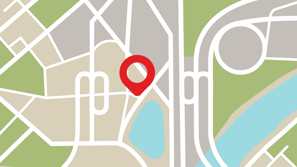
The new logo is free from overloading and the connection with the company's distant past, when it used to be a taxi service. It «has lost» a taxi box, and the corporate red square evolved into a geotag, symbolizing the present and the future of the company as a global information service.
The first company's logo was developed in 2004. During the time of its existance, the company has taken part in technological changes of the taxi service market, Internet-services development, constantly expands its work geography and has formed the complex of services for all market players: taxi customers, individual carriers, taxi fleets, order services.
The new logo demonstrates up-to-dateness, mobility, service friendliness to all user categories and corresponds to the company mission — continuously improve the interaction between passengers and drivers, help people move towards their goals..
Updating a logo is a logical continuation of «Maxim» brand positioning as a high-technology service.
The adoption of the «Maxim» new logo is carried out gradually in all points of users contact with the brand: applications, payment terminals, corporate sites, promotional materials, document flow and others.